Five common vehicle graphics design mistakes
The secret to effective advertising is to make a great and lasting first impression. There are various ways in which businesses advertise themselves, and vehicle graphics are one of them. They are a great way to spread a business’s message, drive more sales, and increase awareness of your products and services.
However, the effectiveness of your campaign depends largely on the quality of the graphics used. They should be able to attract attention without being too disruptive. Often, businesses make mistakes with their vehicle graphics design, which renders them ineffective. Here are some of the common vehicle graphics design mistakes to avoid if you want your advertising to stand out.
Bland graphics
The worst vehicle graphics design mistake is an uninspiring design that does not attract attention. The vehicle wrap must be visually appealing so that people want to look at it and read what is on it. if your design does not capture the eye and just features some bland text, chances are that passers-by won’t even bother to give it a glance.
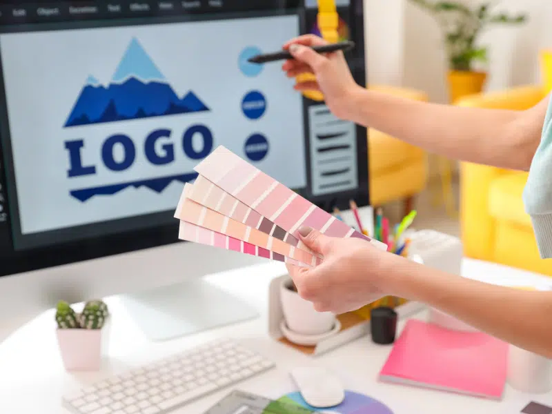
Using attractive colors, creative graphics, and interesting details can make your vehicle wrap stand out and capture the eye. People will notice it and take notice of the message you are trying to convey. For this reason, it is extremely important to have an experienced professional do your vehicle graphics design.
Too much/hard-to-read text
Less is more when it comes to vehicle wrap text. Most people will look at your vehicle while passing it by in driving lots or while driving, so you will have a window of only a few seconds to put your message across. So, having too much text on the vehicle wraps is a bad idea because no one will have the time to read large blocks of text. Keep it concise and include only important messaging.
Do not forget a strong call to action. Another key mistake to avoid is the use of complicated fonts. Even if the text is short, people won’t be able to read it if the font is very complicated, especially because it’s on a moving vehicle. The choice of text and font should be such that it should be legible even from a distance.
Wrong choice of colors
The colors you choose for your vehicle graphics should match your band or marketing campaign graphics. Using colors that are not consistent with the brand would render the advertising campaign ineffective. So, one should avoid the use of colors that don’t properly contrast each other.
Each component of the design should clearly stand out and not blend with the background. The text, logo, and other images should be clearly visible.
Not keeping vehicle dimensions in mind
Vehicle graphics should be designed keeping the mind the type, dimensions, and contours of the vehicle. You cannot use the same graphics design on your car and the trailer.
When you try to use the same graphics on different vehicles, the design will look distorted. So, it is important to design for the vehicle.
Using poor-quality images
Poor-quality images can be a costly mistake as they can make the graphics look bad and poor quality. Poor-quality images are hard to see and adversely affect the overall appeal of the graphics. So, it is important to use only crisp, high-quality images.
When designing vehicle graphics, there are some common mistakes that designers tend to make, but with proper attention and planning, they can be easily avoided. By avoiding these common vehicle graphics design mistakes, you can create more effective and impactful designs that truly represent your brand.
If you are looking for best-in-class vehicle graphics design and printing services, you have reached the right place. Get in touch with our expert designers to discuss your project.