Vehicle wraps are one of the most effective and highly visible forms of advertising. It can generate incredible exposure for a business because a wrapped vehicle could be seen by hundreds or thousands of people each day. Vehicle wraps help make a great first impression, even before someone visits your business or speaks to you. Vehicle graphics are also a great way to spread your brand story and business’s message. Nonetheless, many businesses fail to benefit from vehicle wraps because of a few avoidable errors. Following are the common design mistakes that can ruin your vehicle wraps:
Wrong colors is a big vehicles graphics mistake
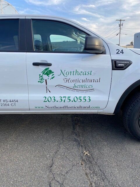
Color is not always selected only on the basis of aesthetics or its ability to make things good. Color conveys deeper meaning and is a design feature that captures attention the most. The color you choose should align with your brand and industry. For example, orange-red hues work great for transport, and blue works well for the financial sector or construction businesses. Also, it is important to keep in mind that different colors have different psychological effect-red, yellow, and orange can spark emotions ranging from warmth, comfort, and enthusiasm to anger. So, it is important to choose the right color and color contrast.
Illegible Fonts
There is no point in having a beautifully designed vehicle wrap if no one can read it. A moving vehicle is visible to people for only a few seconds. So, it is important to ensure that the fonts are easy to decipher and the text is easy to read. If you use fonts that are too artful, you will not be able to communicate your message to the audience and people will not be able to contact your business.
Too complicated, overcrowded content is another vehicle graphics mistake to avoid
It is important to keep it simple. Remember, you only have a few seconds to capture your audience’s attention. Do not go overboard with images, copy, colors, or design. Keep it to the point because a complicated design is distracting and fails to do its job of delivering the message.
Not designing for exact measurements
Each vehicle is different in terms of size and shape. You need to keep in mind where the doors, door handles, latches, gas cap, hood, roof, and other seams are. Each design should be exactly tailored to the size and specifications of the particular vehicle.
Overlooking typos
While it seems unlikely that someone could make typos on a vehicle wrap but it happens more commonly than you can think, mainly because the design is not proofread properly before it is printed. Having typos and misspellings in your vehicle wrap design is the worst thing to happen. It is important to check the text properly before the wrap goes into print. Overlooking them can make your business look highly unprofessional. Pay special attention to the contact information because any mistake can defeat the whole purpose of using vehicle wraps.
Inconsistent branding
Even a great design may not have the desired effect if it is not consistent with the rest of your brand. Your vehicle wrap should blend well with your overall branding and complement other marketing collateral and branding initiatives. It should boost your marketing efforts.
Of course, these are just some of the graphics mistakes that can impact the success of your vehicle wraps. If you are looking to get started on the design of a vehicle wrap, get in touch with us for a custom solution. We specialize in fleet graphics and our team can help maximize your presence on the road with quality design and installation.