Make Your Business Sign Design Attractive With These Tips
Need a new business sign design? Whether you’ve just opened up shop, have a new promotion or need to create way-finding, business signs are an important part of your marketing and operations and needs to be carefully considered. Here are 6 essential tips to help you produce a highly effective business sign design.
1. Keep it simple
Often signs are viewed at a distance and at different angles. A sign that is too busy will make it difficult to read in these circumstances. Many people view signs as quick references, not sources of information. If you try to say too much it will only serve to overwhelm and confuse. Don’t be afraid of white space – it adds to readability. When you have white space it can seem as though there’s not much going on or that something is missing, but often the reverse is true. When you have less to confuse people, they are able to focus better on what is important.
2. Make it 3D
Often the prospect of a 3D sign is overlooked. Perhaps it is seen as too complex, too expensive or not necessary. 3D Signs come in a variety of styles and can complement almost any business. Going 3D is an extra investment, but it can be well worth it.
3. Illuminate your Business Sign Design
Whether your business is open at night or not, an illuminated sign keeps your business visible at all hours keeping your brand on people’s minds. LEDs are generally considered best for their longevity and low energy consumption.
4. Be smart with color
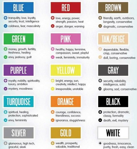
Color plays a significant role in the effectiveness of brands and their signage. Color psychology can help you to produce better, more effective signage. For instance orange can generate a feeling of optimism, red a feeling of urgency, blue a feeling of trust. What feeling do you want to convey and what colors can help you to achieve that?

5. Focus on color contrast
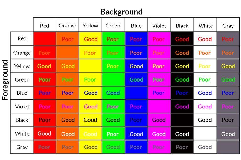
Color contrast is essential to how readable and eye-catching your sign is. Neutral colors for instance blend in with the environment. Some better combinations include:
- Black background – White/yellow text
- White background – Black, dark blue, green or red text
- Red background – Yellow/white text
- Yellow background – Black, dark blue or red text

To check the contrast ratio of any color, there are dozens of free online tools, these are generally designed for web-standards, but give you an idea for print as well. This is especially important when producing ADA signs, and the highest contrast ratio should be sought.
6. Plan, plan, and plan for your business sign design
The end result can often be simple, but what comes before takes a good amount of time and planning. For instance the size of the lettering should be carefully considered, especially if you want to be seen from the road. You need an inch in height for every 10 feet away the sign will be viewed. Where you plan to install your sign matters a lot when deciding on the font size. You need to consider who will view the sign, from how far, and what possible angles. This should help you to get an idea of how large the text should be. If your sign needs to be ADA compliant careful planning will also be needed to ensure it meets the correct standards.